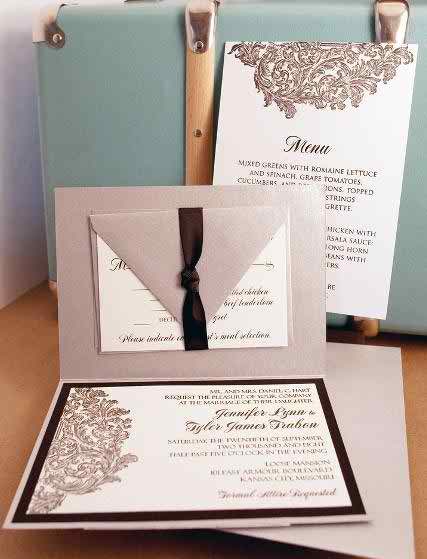
This is our last topic up to this moment regarding the wedding menu. We hope that you’ve made a general idea regarding this topic and the following examples to help you as much as the ones in the first two topics did.
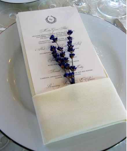
We start with a nicely arranged menu! This menu is made of cardboard and it has a nice writing on it together with really nice details. The menu looks really great and it will look much greater if you put it in the plate. Also you can create a wonderful support for this accessory: like a sleeve, but make sure that a part of it hangs out. You can put in that sleeve a nice branch very pretty colored. This last detail we’ve mentioned about denotes your natural and humble side and it really goes great with the rest of the arrangement. We consider this example as being exquisite and we totally recommend it.
<-336x280 Large Rectangle - center->
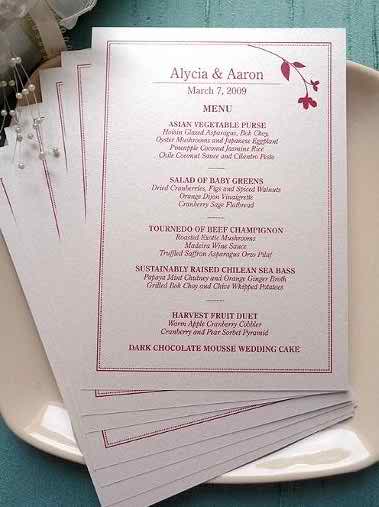
We continue with a minimalist model and its basic colors are: white and red. Take a white sheet of cardboard and there should be a frame somewhere on its margins. Let’s also mention that you can put a normal handwriting and on the upper side of this menu you can attach a nice motif, like a flower or a butterfly that comes to break the minimalist tone of this detail.
This next menu looks delightful. Think of a yellow cardboard with nice patterns on it, a rough texture that can be felt when you touch the menu. Also around this sheet of carton there is a nice frame created by lines and in the corners there are tiny, vintage details that come and make this simple piece of cardboard a unique thing. Put a nice writing on this cardboard and let’s also mention the between the types of food you may stick a little tiny little marble that imitates a precious stone.
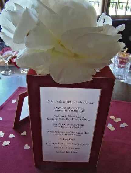
One of the last examples regards a complex invitation that can be misunderstood with a floral arrangement. And why is that? We’re speaking about a cubical vase made of cardboard that contains the foods that your guests will consume. This is made in red and white colors with black writing. On every face of this accessory you can observe the menu for the guests. On top of this accessory you can admire a beautiful flower. And here’s how you save money: use this ornament both as a menu and as a vase for the flowers and put it in the middle of the table. Sounds tempting, doesn’t it?
The last example regards a marvelous model of menu, which looks vintage in the same time. This menu is made of black and white, classical that is. So it’s made of white cardboard with a nice writing and on the margins you can see a frame formed of black lines. Besides this frame there are some details put there, maybe vintage those are represented by flowers and leaves….
And here’s how you can take an idea from here and there and you create a wonderful looking menu that will suit perfectly with your wedding theme and all the accessories you intend on using on your wedding day. Good luck!


