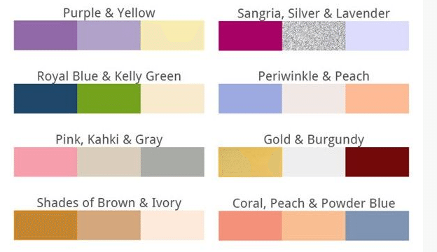
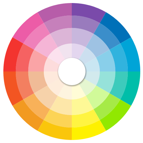
When brides are struggling to pick colors at the beginning of the planning process, one thing they wonder is, what do the colors “mean?” What vibe do they give off? What traditions and sensibilities are they grouped with?
We’re answering all that fun stuff today. We’ve created a list of some of the most popular wedding colors and divulged the meanings behind them. Let’s have a look at some brides’ favorite shades and maybe you’ll get a bit of inspiration for not only the hues that should be used for your own big day but the vibe that follows the vision.
The Most Popular Wedding Colors & Their Meanings
Diamond-White
When brides around the world think “Western wedding,” they picture this. Ever since Queen Victoria, bright diamond-white has enjoyed strong associations with purity and the privileged, but these days, white may have (a lot) more to do with modernity. This is the same breeze that brings us minimalist Calla bouquets and lace-free-zone Vera gowns.
Ivory
Ivory is elegant, old-world, and soft-spoken. Ivory speaks of hand-polished silver and ironed linen. Or in Economist-speak, ivory is New York’s Brooke Astor to Leona Helmsley’s scarlet. It’s also what most wedding dresses come in as “pure white” isn’t something that most designers even dip into anymore.
Champagne
Refined and traditional, rich and conservative. A gentle look with a slightly vintage feel.
Lavender
Soft, dainty and ladylike, this color often appears in weddings that hark to the past, with traditional-looking cakes and florals.
Blush Pink
The lighter shades of pink speak to happiness, playfulness, and a sense of fun, not to mention a special fondness for love’s super-sweet early years.
Fuschia
Energized, “girl power” hue with an almost-punk edge. Think Gwen Stefani, and as possible accents, black, brown or vibrant green.
Cherry Red
Passionate, dramatic, and dripping with desire, this romantic hue hints at deep lows, higher highs, and a triumphant peak (which of course coincides with the wedding). Often paired with crisp white and black in gorgeous toiles or other classic patterns, and sure to show up in tandem with tons of rose petals.
What else? 1) It’s no coincidence that Longoria-Parker’s red wedding took place in Paris. 2) You’re a chocolate and champagne kind of gal. 3) When the wedding’s over, he’d best not forget your anniversary.
Coral
In weddings, this color often has an indie vibe. It might have a Latino, East Indian or Caribbean feel, or just a strong designer foundation. You see it show up in fresh pairings like coral and rust or coral and teal, or more conventionally, with chocolate brown, pink or yellow.
Going to a coral wedding? Don’t be surprised to see a bit of mehndi on the bride’s hands, paisley patterns, custom stationery courtesy of a hotshot graphic designer, luscious linens with lots of shimmer and tassels, or cinnamon-chocolate truffles. Oh, and don’t forget to bring me.
Sunshine Yellow
Optimism, cheerfulness, a strong appreciation for friendship. Yellow is 100% angst-free. It’s also Martha Stewart’s signature color, so yellow often goes hand-in-hand with that clean, grounded New England look, with lots of buttery porcelain and handmade papers.
Gold
Lavishness, luxury, warmth, tradition – closely related to champagne. As platinum continues to make inroads in the jewelry world, “yellow gold” is more of a statement than ever. Think Louis XIV, “The Sun King,” warm Italian weddings, and unstinting shows of abundance.
Aqua
Fun-loving, fresh and vibrant. A favorite of beach brides, especially tropical ones, and an anchor for poolside weddings. But aqua shows up in plenty of other places, too. It’s a favorite paired with chocolate brown for brides who want a fun and modern palette, and aqua and pink aren’t uncommon.
Royal Blue
Grand, traditional, and casting an eye toward an idealized past. Evokes ballrooms, Cinderella stories, and happily-ever-after. Often combined with a paler blue, yellow or gold.
Sapphire
This ultra-classic color signals a preppy wedding. Often paired with mint green or dusty orange, and loads of crisp white, this color puts tradition first and adds a certain masculine gravitas to the palette.
Plum
Plum purple has strong, historical associations with royalty, especially in sacred contexts (think: Lent’s purple to mark the royal approach). But thanks to lots of shakeups in the fashion world, purple’s taken on a whole new life, and become challenging and mysterious, glamorous and grown-up, and ever-so-slightly Eurostar, especially when paired with other complex hues like charcoal or even black. Rock this latter look with feathers, brooding florals, and few Goth-Edwardian touches.
Silver
Restrained wealth and glamour, sophistication. Silver says, “I can afford it, but prefer not to flaunt it.”
L: David’s Bridal. R: Cakes By Gina.
Misty Gray
Modern, understated, retro-informed and sleek. Lately, gray has deposed champagne as one of the hottest neutrals in weddings. Bridesmaids in gray with deco-rhinestone buckled sashes look up-to-the-minute … and stunning. Pair with wheat or heather for the ultimate urban, slightly Swedish palette.
Chocolate
So everywhere, it’s hard to pin down, but chocolate brown is the cornerstone to most of today’s modern palettes: brown with pink or aqua, or increasingly, coral, mint green or purple.
Shades of Green
In weddings, green reveals a modern sensibility and often comes with inventive, non-traditional florals (think green button mums or wheatgrass). Thanks to the increasing volume of eco-talk, green is also a prominent hue at environmentally-conscious weddings. Lime green + hot pink says “pop princess.” Olive or bright green combined with black & white looks downright regal, in that new-millennium way. We also love mint or sage greens as well.
Midnight Black
Sophisticated, mysterious, assertive or even nostalgic, black shows up when couples have strong opinions about design. Black might lend a clean, graphic look to the wedding, or show up in evocative, Victorianesque forms, such as black Callas and rooster-feather collars.
Legions of black-draped bridesmaids continue to make a showing from summer to winter, with more attention to detail than in seasons past (contrasting sashes, more elaborate hemlines, or bouquets designed to pop against a black background).


